In visual communications, you really have to reach out to your audience if you expect them to notice you. However, as you reach out to them, be careful what you say, and be sure to listen. When you get their attention (like in an interview), don't slap them in the face with too many words (over-eagerness) or a blank stare (lack of understanding of the purpose). This can be said for both human interaction and audience/media perception -the two themes running through the show.
01A
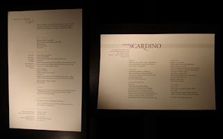
Meghan and Cindy both display a good grasp of layout, provide something interesting to look at, a good size, refined typography, and carefully selected paper -a formula for success. More than anything the paper catapults these two to the forefront. Cindy has the best paper of the show -cardstock with lots of texture and a little color. These two are similar typographically and I like them both very much. The resumes are elegant and seem serious in terms of being used for obtaining employment. No break-throughs in terms of uniqueness or originality, but tasteful communicators overall. Also, excellent color choices.
01B
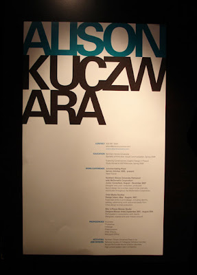
Bold, and I don't mean the font style. Alison breaks through the pack with oversized form and type. Once you have this in your hands, you absolutely must find Alison to see who she is. That's effective. I still haven't attempted to pronounce her last name, but apparently that was intentional on her part. It's not just the oversized-ness that makes it stand out. The layout and typography would work at any scale. It's mesmerizing. If you have a stack of resumes in your hand, you see the word "Alison" above all the other resumes. Everyone was 8.5x11 or smaller, only one person imagined she could be bigger. It worked. People were talking about this resume, especially around the Table of Resumes, because it clearly stood out the most. The stacked type works well as a poster-like graphic. I was talking with a creative director from Whitman Hart and he was jumping in with suggestions on how it could have been done differently, with more variation in the last name, perhaps more or less weight than the first name, but I feel it sits pretty well on the page just the way it is. If it had been a more decorative font, it might not maintain that steady in-your-face impression. I also like the subtle use of full-bleed. I think this look will speak loudly to the type of folks who hire entry level designers.
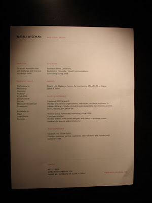
Natali's paper is extremely well-chosen. I think it's Strathmore by the watermark, very tactile and rich. (She must have a hook-up with UniSource.) You want to keep holding on, it wants to keep holding on to you. I was tuned into the "web + print design" at the top since I mostly work on web projects (keyword-me), overall it's pretty well thought out, similar to Meghan and Cindy, not Picasso, but sound fundementals. Awsome paper. And for some reason I'm not put off by the pink.
02B
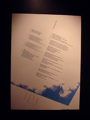
Speaking of Picasso the next two use the page as more of a work of art. That can be risky for a resume, but if you pull it off, it can be transcendent.
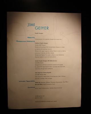
THE LITTLE ONE
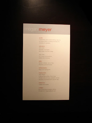
Another unbelievably sharp paper choice. This year's grads must have read my previous diatribes about the importance of fine paper. This small resume is simple, cute (cute?), and to the point. The m in Meyer aligns with the text (more on that later) and it's just so simple and easy it looks great. It's mini-refined. The font choices show maturity. Says "Corporate". The page could get lost in a stack, or it may be moved to the top of the pile as it is the smallest form.
THE THREE WITH THE ROUNDED CORNERS
I'll start with Ethan since I talked to him.
Ethan I hate to break it to you buddy, but you weren't the only one with rounded corners.
Ethan's posters were the most impressive single project that I saw in the whole show. I was standing over there drooling at the level of detail and the complexity of the layout. Great work. I highly recommend this designer.
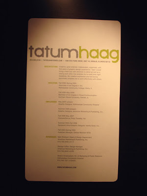
A smart and charming resume, buy why is everything pushed over so far to the left? -Nice paper choice


04A
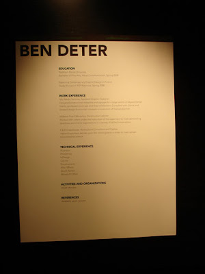
Arguably some of the best typography of the group in Ben's hefty resemator. However, I was driven insane by the too-dark-to-read text in the black stripe that full-bleeds across the top. Here's the deal: if it prints out too dark, you have to go back and print it again. Ok? I print things out one hundred times to get the right levels for the particular printer in use.
With commercial printing you have to work with the printer-vendor to supply proofs so that you can test and test again to ensure that your client's piece is in fact going to be delivered as it was designed. I would have reversed out that text moreso. Remember Megan above? Ben also does a good job to align his D with his text, a convention wizely chosen by many of the grads. I noticed others who failed to grasp that should-be-instinctive-by-now grid concept. This screams Austrian-Swiss border industrial town, very matter-of-fact and determined. Could use one more iteration. The last name agrees with the presentation.
04B
THE TWO WITH THE ACTIVE PERSONALITIES
Phillip crosses the Hawaiian shirt with the skater skull and crossbones for some reason...
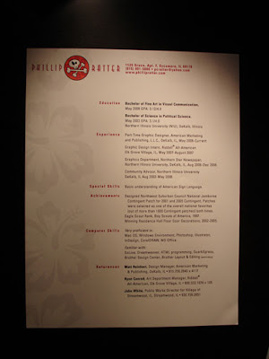

05A
THE OTHERS NOT IN THE GARBAGE CAN
Claire and Matthew were similar, ok, and the rest are in the can.
Matthew had a logical explanation for the boxes merging, he said that the boxes represented him and the company coming together, beginning their crossover. Nice explanation and sound reasoning, but there's no way anyone could have figured that out by looking at it alone. It just looks like a pattern you might find on a drinkin' shirt on Steve Dahl in Phillip's Hawaiian Surfer Bar in Florida. I was happy about the red line at the bottom, so cut and tiny which can only be pulled off well by a skilled hand, but the overall look has reinvented the default design template. There are opportunities for more of the page elements to align with one another. Presentation graphics? There is value in having meaning, but the audience needs to be able to pick up on it somehow through context clues or text.
Clare's paper has tiny textural pinstripes that run vertically which is reinforced by the line she uses. Ok colors, fairly interesting layout, good size.

That's it for now. Check out my new feedable, it's an evolving project for you, the designer audience.

1 comment:
There are some good resume format, but these days traditional resume lacking there way, its the era of visual resume this can help you to stand out form the crowd.
visual resume format
Post a Comment