Bernie Mac dies at 50, and Issac Hayes dies at 65.
How did my blog turn into an obituaries commentary? Well just in case you weren't paying attention:
Isaac Hayes, 65, a Creator of ’70s Soul Style, Dies
http://www.nytimes.com/2008/08/11/arts/music/11hayes.html?ex=1234065600&en=2005a6ff7988c00c&ei=5087&excamp=OVHEisaachayesnews&WT.srch=1&WT.mc_ev=click&WT.mc_id=HE-S-E-YH-NA-NA-isaac_hayes_news
Thousands pay respect to Bernie Mac:
http://ap.google.com/article/ALeqM5gHl5yE4SB9V2syQTXVU2o-N-lo6gD92JKB9O0
Saturday, August 16, 2008
Monday, June 23, 2008
George Carlin dead at 71
Lo! It's a sad day for comedy, and a sad day for all sarcastic bastards. My hero George Carlin died last night. I remember seeing him in the mid 90's at the Star Crowne plaza -I took home a shirt that said "Simon Says Go Fuck Yourself" and only had the courage to wear it a few times. He really knew how to let loose, but he always had a way of reigning it back in. So many of his comic bits crossed way over social lines and polite society, but I always felt that while he was cursing Tiger Woods and Lance Armstrong, that he was still holding back many conclusions that would have logically followed from his reasoning. The child within him would always take his routines back to 'silly'. It's almost like his dirty jokes were just good clean fun in his world. As mad as he sometimes was, he never took himself too seriously. He will be sorely missed, and he is truly irreplaceable.
For now we have: http://richarddawkins.net/
For now we have: http://richarddawkins.net/
Sunday, June 22, 2008

Tuesday, June 17, 2008
Tiger Woods has a new Rival: Everyone.
This weeks U.S. Open spotlighted a few major issues with professional golf. First of which is that Tiger Woods does indeed have a rival, and his name is The Field. With Rocco Mediate coming oh-so-close to beating Woods, albeit with an injured knee, Woods showed that he may have vulnerability as he ages, and that he does have a rival unlike any great rivalry in the history of sports: Woods vs. The Field. Even odds.
It is amazing that Tiger prevailed at the U.S. Open. He just does not let anyone win. On the other hand, with sponsors and corporations constantly sucking his dick it's hard to imagine this four star all-American over-achieving marketing freak continuing this kind of shenanigans forever.
As George Carlin said to open his last HBO comedy special: "Fuck Tiger Woods."
Americans are now rooting for the underdog. Even if all the sportscasters are smitten.
The U.S.G.A. put on an unbelievably fair test of golf at Torrey Pines. With the graduated rough, the further offline you were, the more you were punished. The greens, while running fast, didn't seem to be in the greatest of condition considering all the bumps and chunks from the scores of players who walked through there preceding and during the tournament. And I like how they switched up the tee locations, if anything it was a break to be closer if only for a couple of days. There truly was an element of luck running amuck when Tiger holed the putt on 18 to force the playoff with jovial Rocco Mediate. You could see the ball bumping and jumping all over the place, which is probably why Tiger was so thrilled when the ball fell. He knew that he got lucky, and we all know that luck alone cannot carry Woods through another major.
Rocco Mediate? He certainly is one of the happiest, most human golfers we've ever seen get the privilege of answering questions for the press. It's not dissimilar to when what's-his-name Paul Goydos, yesterday's Rocco Mediate, lost to Sergio Garcia (with a two putt) at The Players. Paul Goydos is long forgotten as will be Rocco, but Sergio and Tiger continue at the forefront of the marketing campaigns of the real majors: Nike and Adidas.
Bottom line: The Field (namely everyone that is really good at golf who's name you don't know) is eventually going to overtake Those With The Big Names, and I'm guessing most of golf's spectators can't wait.
Too bad Justin Rose can't break the surface. And everybody loves Adam Scott, why can't his Australian ass post any major victories against Tiger? The Field has got to learn to be more clutch players. No excuses, beat the leaders. Where's Steven Ames' smack talk for God's sake?
And aside from Adam Scott, you know who us Americans all deep down rooting for... you know...
Boo Weekley! (who is 7 days older than I am) Win dem dang tournaments Boo. Dang. Ain't nobody beatin you, yessir. You're what golf need: a little bit of southern charm and a whole lot of the American human condition.
Who's the next winner: Jeev Milkha Singh? He'd make a fine statement by beating Tiger in the final group on the final day of a major. Or Ryuji Imada? Some international player has got to find it within themselves to topple the incumbent. It's just a matter of time. Look at Ochoa vs. Sorenstam.
Daniel Chopra or Ian Poulter? Charles Howell III, or David Love III? Buba Watson or J.B Holmes? Woody Austin or Steve Sticker? Jim Furyk or Stewart Cink? You know what I'm talking about...
Tuesday, June 10, 2008
The Ravenswood Billboard Factory

I recently did a brand identity (logo, corporate identity) project for the Ravenswood Billboard Factory, and we subsequently had our wedding there. I would recommend this venue which is a great northside Chicago wedding and/or reception event space. It is a large versatile space that can hold parties from 100 to perhaps 1200. Contact Hayes Properties for more info. Wonderful space. Our party went off without a hitch and everyone had a great time.
The Ravenswood Billboard Factory - Wedding Ceremony and Reception Pictures


Tuesday, May 6, 2008
Obama can be a regular guy, but he's an outstanding candidate, say, like Payton Manning as a quarterback.
The L.A. Times writes an almost perfect article on today's state of the election, appealing first to Hillary supporters, then to Obama supporters, since they're the only ones who actually read to the end of the article. Thus, as an Obama supporter, I copy the end for you:
"Mike Fisher, a resident of Beech Grove, Ind. (population 14,000), got a call from the Obama campaign last week. He was told that Obama wanted to talk to someone whose job was in jeopardy, said Fisher, who is in danger of losing his position at an Amtrak maintenance facility unless he agrees to a transfer.Obama and his wife, Michelle, showed up at his door and spoke with the Fisher family for more than an hour. Fisher and his wife laid out a buffet, including cold cuts and fresh fruit."When I said we had some food, Sen. Obama said he wasn't bashful and just got right up and fixed himself a plate. Just like a family gathering," Fisher said. Later, the campaign asked if Fisher would introduce Obama at a stop in Indianapolis. He agreed, and the campaign e-mailed him to suggest talking points."He sat down at our kitchen table, put both elbows up on the table and said, 'Let's talk,' " Fisher told the crowd Saturday. "Barack and Michelle listened and understood and it was like talking to family. It was that easy talking to those two. They're a regular couple. They're regular people." A folksier, more informal Obama is also often on display. Last week he stopped at a VFW hall in North Liberty, Ind. (population 1,357). Shirt sleeves rolled up, he ordered a beer. Domestic beer."I'm going to have a Bud," he said. Drinking deeply from the can, Obama took some questions about high gas prices and cast himself as a champion of the working class.Saturday night, the Obama family popped into roller rink in Lafayette, Ind. As a deejay played the Village People's "YMCA," Obama spelled out the letters with his arms and legs, as any Village People fan would.While Obama shook hands, his two daughters, ages 6 and 9, skated. Obama later went out and joined them, protectively holding his younger, Sasha, as she struggled to stay upright. A battery of TV cameras captured the father-daughter moment.New language in Obama's stump speech is meant to reassure voters who may have been put off by Wright and wonder how much of the preacher's philosophy rubbed off. Obama tells how he was raised by a single mother, how his father left the family when he was only 2."You want to understand my patriotism? It's my understanding that only in America is my story possible, Michelle's story possible -- that I owe everything to this country," he said. "
From the LA times at this link.
http://www.latimes.com/news/nationworld/politics/la-na-campaign6-2008may06,0,3255172.story?track=rss
Sunday, May 4, 2008
Today's magical imagery
What a day it turned out to be in Chicago. Holy amazing lighting Batman.
[Shown] was just the tip of the iceburg. It was the first real photogenic day in the Chicago springtime 2008. I was able to catch some stunning downtown randomness (today).
Observe:
 Tulips in Chicago


[Shown] was just the tip of the iceburg. It was the first real photogenic day in the Chicago springtime 2008. I was able to catch some stunning downtown randomness (today).
Observe:
Tulips in ChicagoI like this one (below) because the guy is shouting to the left, "hey, you're going the wrong way!" and everything else is pointing his friend back to the right way. The red light says: wrong, no left turn just out of frame... Full size it gives a nice sense of scale to the Pritzger Pavilion's massive infrastructure. Also, there is a sticker of a surgeon's head with a mask on stuck to the no left turn sign looking directly at the guy shouting.

Trump tower is open (below), and under construction. Check out the concrete parking garage for people being built by the drunk crane guy up top... will be dwarfed by the spire, but I'm sure we'll all be happy with the kind of service the Trump Tower will provide... It's open!

And on a more boring visual note, but exciting editorial note, I will be startinig a strand on Chicago Ave. from the lake to... Here's where it starts:

Tuesday, April 29, 2008
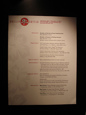
2008 NIU Visual Communications Senior Show Resume Review
2008 NIU Visual Communication Senior Show Resume Review
02B
Speaking of Picasso the next two use the page as more of a work of art. That can be risky for a resume, but if you pull it off, it can be transcendent. 
I'll start with Ethan since I talked to him.
Ethan I hate to break it to you buddy, but you weren't the only one with rounded corners.
Ethan's posters were the most impressive single project that I saw in the whole show. I was standing over there drooling at the level of detail and the complexity of the layout. Great work. I highly recommend this designer.
A smart and charming resume, buy why is everything pushed over so far to the left? -Nice paper choice 

04A
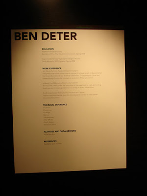
Arguably some of the best typography of the group in Ben's hefty resemator. However, I was driven insane by the too-dark-to-read text in the black stripe that full-bleeds across the top. Here's the deal: if it prints out too dark, you have to go back and print it again. Ok? I print things out one hundred times to get the right levels for the particular printer in use.
With commercial printing you have to work with the printer-vendor to supply proofs so that you can test and test again to ensure that your client's piece is in fact going to be delivered as it was designed. I would have reversed out that text moreso. Remember Megan above? Ben also does a good job to align his D with his text, a convention wizely chosen by many of the grads. I noticed others who failed to grasp that should-be-instinctive-by-now grid concept. This screams Austrian-Swiss border industrial town, very matter-of-fact and determined. Could use one more iteration. The last name agrees with the presentation.
04B
THE TWO WITH THE ACTIVE PERSONALITIES
Phillip crosses the Hawaiian shirt with the skater skull and crossbones for some reason...


Clare's paper has tiny textural pinstripes that run vertically which is reinforced by the line she uses. Ok colors, fairly interesting layout, good size.

That's it for now. Check out my new feedable, it's an evolving project for you, the designer audience.
Do The Girls Take the Cake?
There are always people secretly running around this show (Northern Illinois University's Visual Communications Senior Show) who are very powerful industry professionals, they don't talk to anybody, they look at everything carefully, and they leave with 0-1 resumes. Typically zero, or they never call the one they took. I think mostly they go for inspiration, to see some original thinking, some non-commercial based displays. Or they're there because someone told them about it, and they're just "checkin' it out". If only there were a way for the burgeoning professionals presenting at the show to tap into that sneaky-bastard creative director's head for the 1.4 seconds as they pass by. Wouldn't that be a valuable exchange for the future? It really is all about who you know, and the only way we have in life to know someone is to meet them.
In visual communications, you really have to reach out to your audience if you expect them to notice you. However, as you reach out to them, be careful what you say, and be sure to listen. When you get their attention (like in an interview), don't slap them in the face with too many words (over-eagerness) or a blank stare (lack of understanding of the purpose). This can be said for both human interaction and audience/media perception -the two themes running through the show.
In visual communications, you really have to reach out to your audience if you expect them to notice you. However, as you reach out to them, be careful what you say, and be sure to listen. When you get their attention (like in an interview), don't slap them in the face with too many words (over-eagerness) or a blank stare (lack of understanding of the purpose). This can be said for both human interaction and audience/media perception -the two themes running through the show.
Please keep in mind that I do not know any of these recent grads personally, and I have now conversed with a handful of them as of tonight. This review is strictly based on my perception of the resumes provided at the show
01A
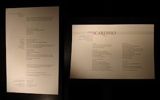
Meghan and Cindy both display a good grasp of layout, provide something interesting to look at, a good size, refined typography, and carefully selected paper -a formula for success. More than anything the paper catapults these two to the forefront. Cindy has the best paper of the show -cardstock with lots of texture and a little color. These two are similar typographically and I like them both very much. The resumes are elegant and seem serious in terms of being used for obtaining employment. No break-throughs in terms of uniqueness or originality, but tasteful communicators overall. Also, excellent color choices.
01A
Meghan and Cindy both display a good grasp of layout, provide something interesting to look at, a good size, refined typography, and carefully selected paper -a formula for success. More than anything the paper catapults these two to the forefront. Cindy has the best paper of the show -cardstock with lots of texture and a little color. These two are similar typographically and I like them both very much. The resumes are elegant and seem serious in terms of being used for obtaining employment. No break-throughs in terms of uniqueness or originality, but tasteful communicators overall. Also, excellent color choices.

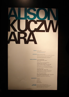
01B
Bold, and I don't mean the font style. Alison breaks through the pack with oversized form and type. Once you have this in your hands, you absolutely must find Alison to see who she is. That's effective. I still haven't attempted to pronounce her last name, but apparently that was intentional on her part. It's not just the oversized-ness that makes it stand out. The layout and typography would work at any scale. It's mesmerizing. If you have a stack of resumes in your hand, you see the word "Alison" above all the other resumes. Everyone was 8.5x11 or smaller, only one person imagined she could be bigger. It worked. People were talking about this resume, especially around the Table of Resumes, because it clearly stood out the most. The stacked type works well as a poster-like graphic. I was talking with a creative director from Whitman Hart and he was jumping in with suggestions on how it could have been done differently, with more variation in the last name, perhaps more or less weight than the first name, but I feel it sits pretty well on the page just the way it is. If it had been a more decorative font, it might not maintain that steady in-your-face impression. I also like the subtle use of full-bleed. I think this look will speak loudly to the type of folks who hire entry level designers.

02A
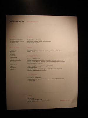
Natali's paper is extremely well-chosen. I think it's Strathmore by the watermark, very tactile and rich. (She must have a hook-up with UniSource.) You want to keep holding on, it wants to keep holding on to you. I was tuned into the "web + print design" at the top since I mostly work on web projects (keyword-me), overall it's pretty well thought out, similar to Meghan and Cindy, not Picasso, but sound fundementals. Awsome paper. And for some reason I'm not put off by the pink.
Natali's paper is extremely well-chosen. I think it's Strathmore by the watermark, very tactile and rich. (She must have a hook-up with UniSource.) You want to keep holding on, it wants to keep holding on to you. I was tuned into the "web + print design" at the top since I mostly work on web projects (keyword-me), overall it's pretty well thought out, similar to Meghan and Cindy, not Picasso, but sound fundementals. Awsome paper. And for some reason I'm not put off by the pink.

02B
Speaking of Picasso the next two use the page as more of a work of art. That can be risky for a resume, but if you pull it off, it can be transcendent.
Theresa combines the angled grid with the floating in of a fluffy cloud (which subtly breaks the grid). It all comes together that way with the blue creating a foundation for the angle which lessens the disorienting aspect found on resumes that are simply on an odd angle. Plus she turns the headlines another -90° so you really get to look all around and forget for a moment that it's an 8.5 x 11 piece of paper. AH! Make that 8 x 11. Just enough to throw you off the ordinary track. At first I didn't notice that was a photo of a cloud and I think it might even be stronger as more of an abstraction. Clouds are Microsofty, plus it implies your head is up in the clouds, which some employers might daydream about. (The extra half inch must have been chopped to get the left and right bleeds.)

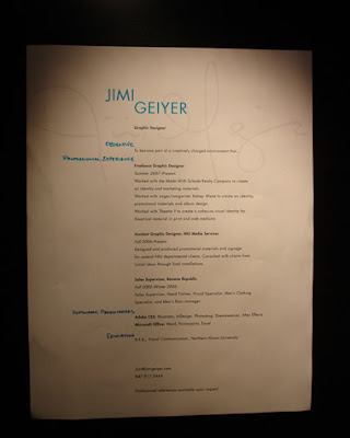
Jimi appears like Emerile the spicey chef with the signature dish. Happily self promoting. His signature itself is a reference to a work of art (instead of being a work of art and then being signed), mixes things up, works well in conjunction with the handwriting (which is rhythmic and friendly) but ...I keep thinking Emerile. I do like how everything aligns to a single axis. Not sure if the signature "happy face" under the first name is intentional or if that's just how Jimi signs things, but I was a little put off by that. I'm not a fan of happy face scribbles in any situation. Some people may disagree. However, there's so much going on here I find myself talking about it, which speaks for itself. My most recent resume (as of the writing of this review) actually ghosts a word in the background too, I use my tagline which connects to a marketing campaign (website, business cards, posters etc.)

02C
THE LITTLE ONE
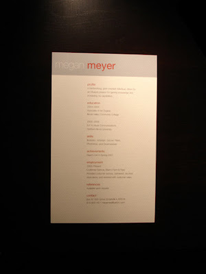
Another unbelievably sharp paper choice. This year's grads must have read my previous diatribes about the importance of fine paper. This small resume is simple, cute (cute?), and to the point. The m in Meyer aligns with the text (more on that later) and it's just so simple and easy it looks great. It's mini-refined. The font choices show maturity. Says "Corporate". The page could get lost in a stack, or it may be moved to the top of the pile as it is the smallest form.
THE LITTLE ONE
Another unbelievably sharp paper choice. This year's grads must have read my previous diatribes about the importance of fine paper. This small resume is simple, cute (cute?), and to the point. The m in Meyer aligns with the text (more on that later) and it's just so simple and easy it looks great. It's mini-refined. The font choices show maturity. Says "Corporate". The page could get lost in a stack, or it may be moved to the top of the pile as it is the smallest form.

03A
THE THREE WITH THE ROUNDED CORNERS
THE THREE WITH THE ROUNDED CORNERS
I'll start with Ethan since I talked to him.
Ethan I hate to break it to you buddy, but you weren't the only one with rounded corners.
Ethan's posters were the most impressive single project that I saw in the whole show. I was standing over there drooling at the level of detail and the complexity of the layout. Great work. I highly recommend this designer.
A smart and charming resume, buy why is everything pushed over so far to the left? -Nice paper choice

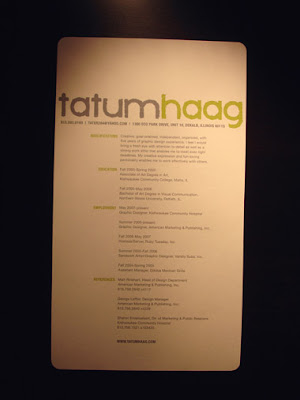
Great size for Tatum, his rounded corners were my favorite of the rounded corners trio. Ethan needs to stick with square corners, we want him to keep all of his fingers. Leave the chopping to Emerile. My creative director friend didn't care for the distressed type in Tatum's name, but I like it. It's not just distressed. In tandem with the colors he chose, and the supporting line of information below, and the lower case and no-spaces it comes together in a handy package. You'll notice a little disregard for margins here, although with the precision cut-down page size it works.

Jorie completes our rounded corner person trio (only 2 corners this time). Seems a little truncated, as if this were an attachment to another piece which is absent. It could use a dotted line or I-don't-know-what else, something.

04A
Arguably some of the best typography of the group in Ben's hefty resemator. However, I was driven insane by the too-dark-to-read text in the black stripe that full-bleeds across the top. Here's the deal: if it prints out too dark, you have to go back and print it again. Ok? I print things out one hundred times to get the right levels for the particular printer in use.
With commercial printing you have to work with the printer-vendor to supply proofs so that you can test and test again to ensure that your client's piece is in fact going to be delivered as it was designed. I would have reversed out that text moreso. Remember Megan above? Ben also does a good job to align his D with his text, a convention wizely chosen by many of the grads. I noticed others who failed to grasp that should-be-instinctive-by-now grid concept. This screams Austrian-Swiss border industrial town, very matter-of-fact and determined. Could use one more iteration. The last name agrees with the presentation.

04B
THE TWO WITH THE ACTIVE PERSONALITIES
Phillip crosses the Hawaiian shirt with the skater skull and crossbones for some reason...

...and Dave puts his glasses on there so you can find him. If you look past those logo/brand elements they both pull off educated layout and type. However, I think they may have gone over the top in terms of kitch. You could argue this either way, but when you start to reveal that much personality (or thematic diarama), it might tip the scales against you if the viewer happens to not like that style, or in your favor if they happen to be on the wavelength (hiring managers are typically not on your wavelength, you have to be on theirs).

In a resume, while I myself have been charmed by a logo mark (Drew, second place '06), you might want to think about limiting the bling. A business card can get away with more bling, a resume is supposed to be a little more formal. On a more positive note, Dave was inclined to reach out and talk to people as you might infer from his design. Thus, while it may appear kitch in a vacuum, it actually represents the person quite accurately.
05A
THE OTHERS NOT IN THE GARBAGE CAN
Claire and Matthew were similar, ok, and the rest are in the can.
Matthew had a logical explanation for the boxes merging, he said that the boxes represented him and the company coming together, beginning their crossover. Nice explanation and sound reasoning, but there's no way anyone could have figured that out by looking at it alone. It just looks like a pattern you might find on a drinkin' shirt on Steve Dahl in Phillip's Hawaiian Surfer Bar in Florida. I was happy about the red line at the bottom, so cut and tiny which can only be pulled off well by a skilled hand, but the overall look has reinvented the default design template. There are opportunities for more of the page elements to align with one another. Presentation graphics? There is value in having meaning, but the audience needs to be able to pick up on it somehow through context clues or text.

Clare's paper has tiny textural pinstripes that run vertically which is reinforced by the line she uses. Ok colors, fairly interesting layout, good size.

That's it for now. Check out my new feedable, it's an evolving project for you, the designer audience.
Subscribe to:
Posts (Atom)